Thursday, September 3

Logo Quiz - Guess the Brand Logos


It is easy to start recognizing the brand logos we see every day; like the coca cola logo, we know what it is, we know what it means, and we definitely know what it does so we always have a picture of the bottle in our head when someone mentions Coca Cola or even Coke!


There are however, some logos which you see every day and yet, do not connect them with anything. I’ll be posting a few of the ones I think people see every day and yet, wouldn’t be able to guess.


This is a very well known logo. A logo you see every day while driving.


Another one of the great American logos, guess who it belongs to?


I got this one for the geeks out there, who think they know everything about their fields.


Guess this one One thing is for sure, these footprints are seen a lot of times when you wear the product they belong to.


This is one of the top selling companies in the states right now.
Let’s see if you can guess this one.I just used a few of these for you guys to acknowledge, and then we shall see how many of our logo fans out there are observant enough to remember all 5 of these.

Tuesday, August 25

Typography Logos - Logo Treats for You

Logos are the forefront warriors of a company. They are designed in such ways that the customer has the logo embedded in their head for ever.


Like if we take the Nike swoosh, whenever you see a swoosh somewhere, you know it’s sponsored by Nike. Just like that, the logos are made as the identity for the company.

Let’s go through a few to see what this whole thing means.


This is a creativity defining logo which you can see being a typography face and name at the same time.


Creativity can come from anywhere, whether it’s a big face or just a face created by using minimal complicated designs. The face on OP is just inspiring.


If you look closely, you can see the name being embedded in the color patterns.

Beautifully done!


As simple as this is, it is equally as powerful. The spray paint effect makes it look awesomely original.


It’s just amazing the way the logo designers these days are working around the name of the company. Slick name and Slik design!


I simply loved this one because of the way the plants are used in the logo. Amazingly elegant


This is more like a cartoonish sort of a design. I liked it because of the use of fire was just catchy!

As you can see, I chose typography as the category for the logos in this blog. Not because these are the best, but because they caught my eye and I couldn’t stop looking at these.

Logo designing is not an easy job, but if you have fun with it, you can always create masterpieces.

Feel free to comment, would love to hear from you.


Monday, August 24

10 Amazing Music Logos

Every business in the world has a logo as its front face first expression. Even if it’s a
music company, they still need a powerful logo to lead from the front. Music logos need to
have music incorporated in them one way or the other to make them stand out from the others.

I have a few Music Logos for you guys today, which have been designed for music companies and similar work.


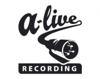
A-live and Alive, sounds similar, but the microphone lead in the logo and the word recording
beneath it, joins them both to form a recording logo.


I like this because of the simplicity it has. Mh2o.com means music oxygen.com, which is
complete when the tagline is read.

This logo portrays a musical note as well as a bit of a guitar in its ‘G’. Good stuff!


I like this one because of the fresh painted canvas effect. Simple and nice


As the musical note forms around the fist, it shows the power of music. Hard hitting!


As the name suggests, the initials can be seen around the drum kit and the guitar neck. Good
concept.


Can you see the double concept? M turned upside down is a W, but is also a wave if put
together. Plus the tagline is a punch.
Another sweet concept here, using the symbol of PLAY as a part of the logo.


This is simple creative. The rock sign, if looked at properly, has a guitar as a thumb as
well.

Good Life, as the name suggests, can be seen all around the logo when the face is wearing
headphones and enjoying the music.
So, as you can see, the music is added one way or the other in the logos. Logo designing is
always a fun job, but you need to have creativity to perform your task as well.
I would love to hear from you guys! So keep commenting :) ...

See you soon. Ciao'!


Tuesday, August 18

Logo Design - Best Web 2.0 Logos

Web 2.0 logos is actually 2nd generation designing. It’s all web based and it is usually used for social networking sites, video sharing sites, wikis, blogs etc. Web 2.0 Logos have been used by many different websites, let’s go through a few of them and check them out.


These are the soft logos, which have round typefaces.


These types of logos are futuristic in nature, with the look of future being sharp edged and more technological based.


These types of web 2.0 designed logos come under classics. As you can see the font used in these logos defines the classic era.


And then there are the NEW classics, this type of logo designing is used a lot now as the new trend and using a different sort of typeface as well. The world of logo designing is coming to a new era, the era of the 2nd generation. Which might be new right now, but there will be a time when it takes over.

10 Most Inspiring Logos

There are logos which are designed, you look at them, you think they are good, and then you move on, and then there are logos which are designed and you look at them, get stuck, get inspired and open your mind to a new possibility of logo designing. Let me show you the 10 most inspiring logos I found after a bit of research.


Notice how the background color and the bubbles besides the alphabets make it look actually like its written in cream.

The teeth of the wolf have been designed like the B U W of the Big Ugly Wolf.


Notice the crop being in a different color half way down, portraying the cropped pattern.


The cutlery has been set in such a way that it becomes a table and a camera, both.


Can you see the Gestalt Psychological Vase/faces concept in the butterfly?


Pure classic western style logo


The ‘R’ and the ‘B’ are both in the same place, just a matter of perspective.

As the name suggests Ingenioustries, you can see a chimney with a brainy smoke, or an I with the dot being a Brain, depends on you.

The beautiful texture behind the logo and the shadow created by the logos light is just amazing to watch.
If you look at the logo closely, you can make out the elephant in it as well.

These are some of the best inspiring logos found on the internet right now, and you can see why they are so inspiring, creativity used beyond a normal limit of creation.
Feel free to comment on my effort. I would like to hear from you all. Thanks for passing by. : )